Tuesday, January 09, 2007
Choose Wei Kiat's Business Card Design
Below are three business card designs I came up with. Pick your favourite and comment on it! The best of the 5 will be printed. Feel free to suggest small alternations also.

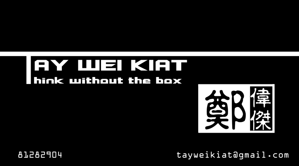
Fusion
 Fusion plain

Culture

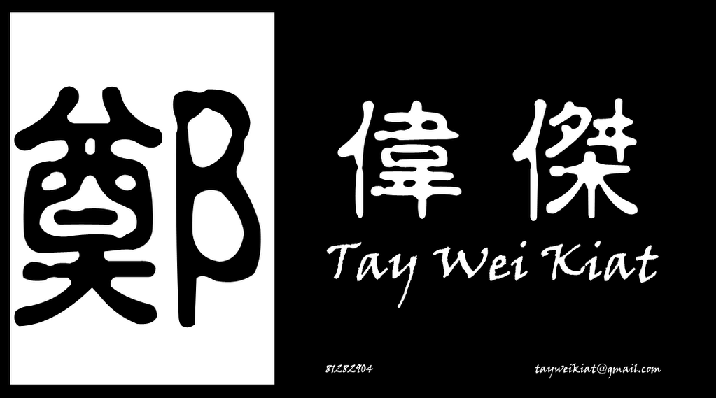
Culture Dark Con

Culture Border

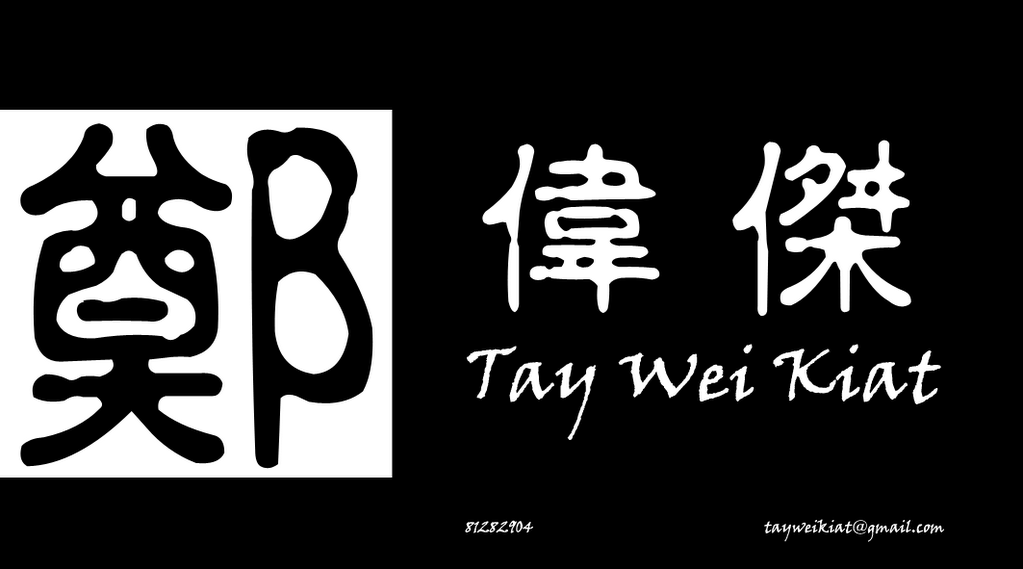
Culture Dark
Fusion
 Fusion plain
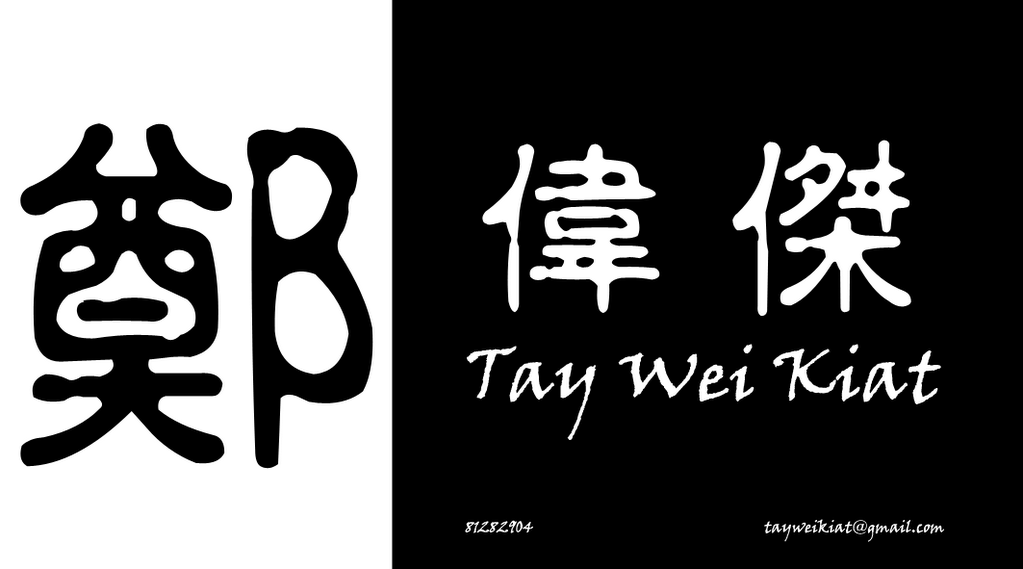
Culture

Culture Dark Con
Culture Border
Culture Dark
Comments:
<< Home
i'd go for the first one (fusion). white backdrop on your chinese surname character makes it standout like some sort of logo. small fine-tuning that may be required: the white space surrounding the character 'zheng' is probably excessive, giving the 'seal/stamp' a kind of disproportionate feel (when viewed together with the characters 'weijie').
one other thing to point out in the arrangement of chinese characters of your 'seal/stamp': i thought they should be read right to left as in ancient chinese scripting (you may wish to check out the seal of the finance minister in the singapore dollar notes for reference) - unless the move was a deliberate one to reflect your motto/theme of 'think without the box', of course.
the last 4 is erm... damned jiaklat in design. reason being the chinese characters are too big, taking up too much space on the namecard. further, (with no insult/malice intended) i note that the left half of the traditional chinese character of your surname looks like the one that's written on altars at funeral wakes (i may be wrong - but it sure looks similar) - i am of the opinion that it's not too good an idea to amplify the surname character (if you insist on using the traditional chinese scripting) due to it's possibly negative association (ah... the fengshui part, i suppose).
other comments/suggestions: you may like to try out a white backdrop, using a bright red colour for your 'seal/stamp' (to make it standout), maybe putting the seal on the top left corner, and using black font with small caps to emphasize on your initials TWK (you may also wanna experiment with various fonts for feel & effects).
also, i note that there is an absence of a business website where people can access and look at a showcase of your portfolio/completed works/etc. so the purpose of this bizcard may be called into question - as in what services are you exactly providing? that may very well be the most critical part lacking in your bizcard.

hi, thanks for taking time to evaluate.
everything is in black and white to cut cost. Since black words on white background is too plain. Therefore i went with black bg.
Business details, I won't be putting in as yet, because some details to be confirmed and worked out before i'm ready to put it in. So far now, its going to be more of a "contact card"
think that the first 2 are the nicer ones.
but u might want to rethink abt putting the chinese name. it looks a bit like the sushi tei card.
but u might want to rethink abt putting the chinese name. it looks a bit like the sushi tei card.
# posted by  : 1/10/2007 7:23 PM
: 1/10/2007 7:23 PM
I'll choose the 1st one.But feel tat Black n white abit too plain.U might wanna put the wicked logo in the card.Anyway,nice font there!
# posted by : 1/12/2007 4:19 PM
: 1/12/2007 4:19 PM
i prefer e 2nd design
but i think it wud look better if u change black+white into some other colour +white....
but i think it wud look better if u change black+white into some other colour +white....
# posted by : 1/13/2007 5:58 PM
: 1/13/2007 5:58 PM
http://markonzo.edu http://www.netknowledgenow.com/members/Flexeril-Oral.aspx http://www.netknowledgenow.com/members/zetia-side-effects.aspx http://blog.tellurideskiresort.com/members/nexium-side-effects.aspx peoria http://www.netknowledgenow.com/members/Tadalafil-Tablets-20-mg.aspx http://blog.tellurideskiresort.com/members/paxil-side-effects.aspx fell http://riderx.info/members/allegra-side-effects-allegra.aspx http://blog.tellurideskiresort.com/members/paroxetine-side-effects.aspx sugar http://www.netknowledgenow.com/members/furosemide-side-effects.aspx http://blog.tellurideskiresort.com/members/esomeprazole.aspx shortish remington
# posted by : 3/05/2010 9:58 AM
: 3/05/2010 9:58 AM
i will chose Wei kiat's business card 1st one design.
Plastic Business Cards
Post a Comment
Plastic Business Cards
# posted by : 4/15/2011 5:50 PM
: 4/15/2011 5:50 PM Subscribe to Post Comments [Atom]
<< Home
![]()
Subscribe to Posts [Atom]